[Framework Review] Forever ✱ Notes: Part 2
Taming information chaos by adding structure to a pile of Apple Notes.
In the first part of this lengthy review, we introduced the Forever ✱ Notes framework and focused on its most distinctive attribute: the heavy asterisk.
I hope you had time to visit the official website and maybe even set up the ** shortcut convention on your devices. If not, there’s no rush. I’d argue that you shouldn’t be rushing into something as big of an undertaking as setting up a note-taking system that’ll theoretically last you for the rest of your life. Forever ✱ Notes might or might not be the one for you, and this review’s primary goal is to help you make an educated decision. This is, arguably, the nerdiest part of the entire review. So, buckle up as we dive into the technical foundations of the system. Once over this hump, moving on will be easier.
Hubs
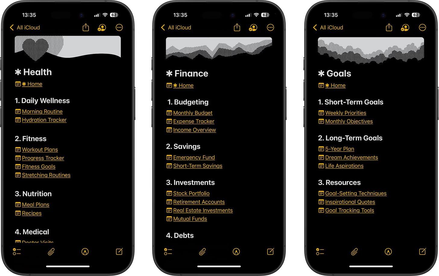
Hub notes act as portals or proxies to other notes. They do not carry semantic meaning and serve a purely navigational purpose. While most of your notes may contain external links and can be seen as hubs, the key distinguishing features here are the absence of content, semantic connections, and, most importantly, the time you spend in the hub note. Hub notes are your “in-and-out” overlays created solely for efficient navigation within your notes vault.
One can spot the idea of a hub note in many PKM (Personal Knowledge Management) systems.
My problem with hub notes, however, is that, at least in their classic form, they have to be maintained manually, which will inevitably lead to entropy. They’ve worked for many prolific thinkers, even those who didn’t have the comfort of the automated generation of such hubs. They had to compensate with recurring note revisions (an excellent thing) and refreshing hub notes. Such notes were the necessary recurrent chore in original analogue systems when smart folders or search were not options. When a hub note like this was updated, it would immediately become stale. Now that we do have automation options, hubs, in my opinion, could be generated, at least partially, automatically. If your TfT (Tool for Thought) is extensible or comes with powerful data management features, you could create hub notes that are either kept in sync for you based on a set of rules or include this along with your manually maintained lists.
Unfortunately, I don’t know of a way to achieve the kind of automation mentioned above in Apple Notes, at least not without sophisticated automation through Apple Shortcuts involving
’ magnificent third-party action library and a lot of elbow grease. You’ll have to go through the motions manually. And, of course, Apple Notes doesn’t allow you to prepare any templates for quick entry. Perhaps this is by design, and in a Unix philosophical way, they want you to use Apple Shortcuts for it. Managing hub notes in this application feels as labour-intensive as DJing with crates full of vinyl records on your grandmother’s vintage hi-fi audio system.…
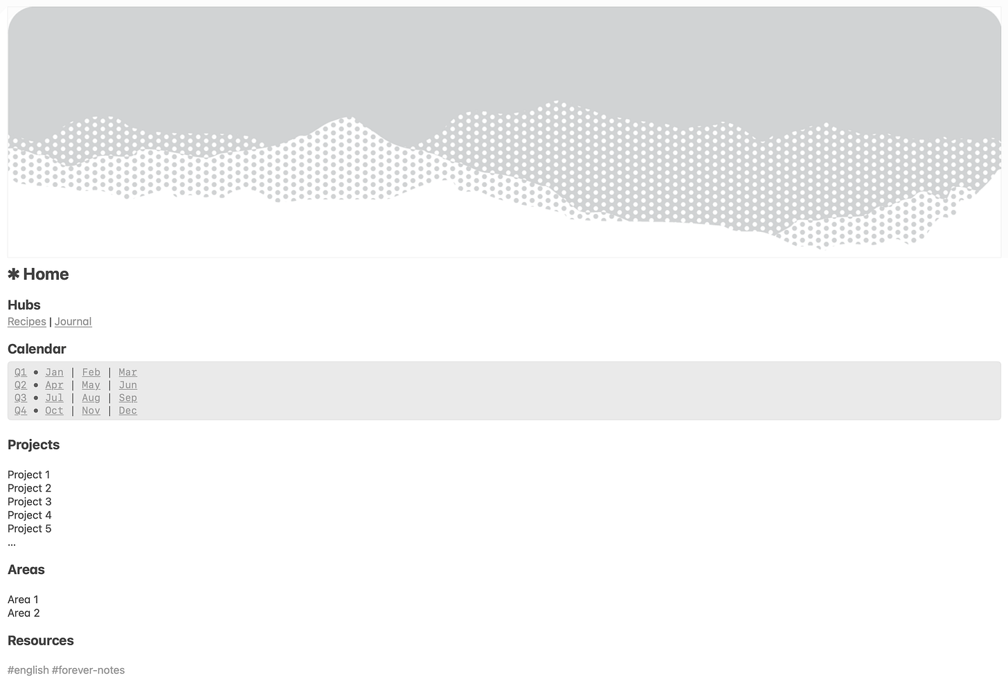
Your hub notes, especially those with lists of short items, will resemble long scrolls whose width is only about 25% or less if you stretch the window to fill the entire screen’s real estate. One could rearrange this into a more ergonomic and densely populated layout.
Notion, for example, has columnar layout blocks that act like HTML flex to help you achieve that. In Markdown, you’d use tables to distribute elements. This requires more code and isn’t as flexible as Notion’s columns, but it works once you get the hang of it or introduce CSS classes into your notes (yuk!).
Generally speaking, tables shouldn’t be used for layout purposes in HTML, Markdown, or any other markup system. They’re for holding spreadsheet-like data. However, since I had no choice, I thought I’d give it a go. After all, we’re using links that are supposed to be semantic for navigational purposes (more on this next). We’re already violating some good practices. This won’t worsen things. Unfortunately, I quickly realised that you couldn’t insert anything but text into Apple Notes’ table cells. Though I think it’s the right engineering decision, this rules out table-powered beautification of notes. Your next best choice is to use the mono-styled font block. Even if you end up using one, its content might still only fill a small portion of the width, as is the case for the calendar block. No matter how you slice it, your hub notes will be among the thinnest in the system.

Links
Just as in good libraries there is a book next to [the one you were originally searching for], that may be more informative than the book originally sought. So, [the zettelkasten is] a way of allowing oneself to be surprised by what one had entered from a completely different point of view.
—Niklas Luhmann1
Most, if not all, knowledge management and journaling systems introduce linking. This is where things become interesting. Our brains are association machines, and our thoughts are interconnected. This is also how you want your notes to be: coupled. This will unlock the possibility of entering your notes vault at any point and let the rabbit hole lead you to unexpected conclusions through the traversal of semantically connected atomic notes. (Notice the emphasis on “semantic”).
Forever ✱ Notes uses two types of links:
Knowledge
These are the typical “connected knowledge” semantic links we refer to when discussing knowledge graphs. Those represent the meat and potatoes of your linked thinking. There’s no arguing about the importance of such links in your thinking.
In his book “A System for Writing” and many interviews,
praises letting himself get lost in his notes. He rarely knows where he’ll be at the end of the research or a writing session, which is good.Navigational
This is how you create hierarchies and sequences in Forever ✱ Notes. You can recognise Niklas Luhmann’s Hub notes and
’s MOCs (Map of Content) as proxies containing segues to lower-level note classification hierarchies.Another sub-type of navigational links involves chaining notes, allowing you to navigate to the immediately preceding and following notes. This technique can also be found in
’s Bullet Journal (BUJO) method and ’s (LYT).While Luhmann’s Zettelkasten does not use explicit note-chaining links, you can spot it indirectly within the labelling convention that indicates precisely where a note should go by reading its unique ID. This is advantageous because the ID simultaneously reveals the note’s location within the hierarchy of topics and its sequence number within the folder, reflecting when it appeared.
…
It sounds nice, but the bummer is that navigational links will pollute a typical knowledge graph if you mix them with semantic ones. This could have been circumvented if relationships were considered first-class citizens with their attributes. For example, they could implement relationships in HTML tags, such as the rel attribute. Alternatively, you could tag them accordingly and hide all notes with such a tag and, consequently, their inbound and outbound relationships, therefore decluttering the web of your knowledge. However, none are available in Apple Notes or other dedicated TfTs. Of course, if you require such a depth of knowledge linking, you have already outgrown Apple Notes many times, so let’s not get into the weeds.
…
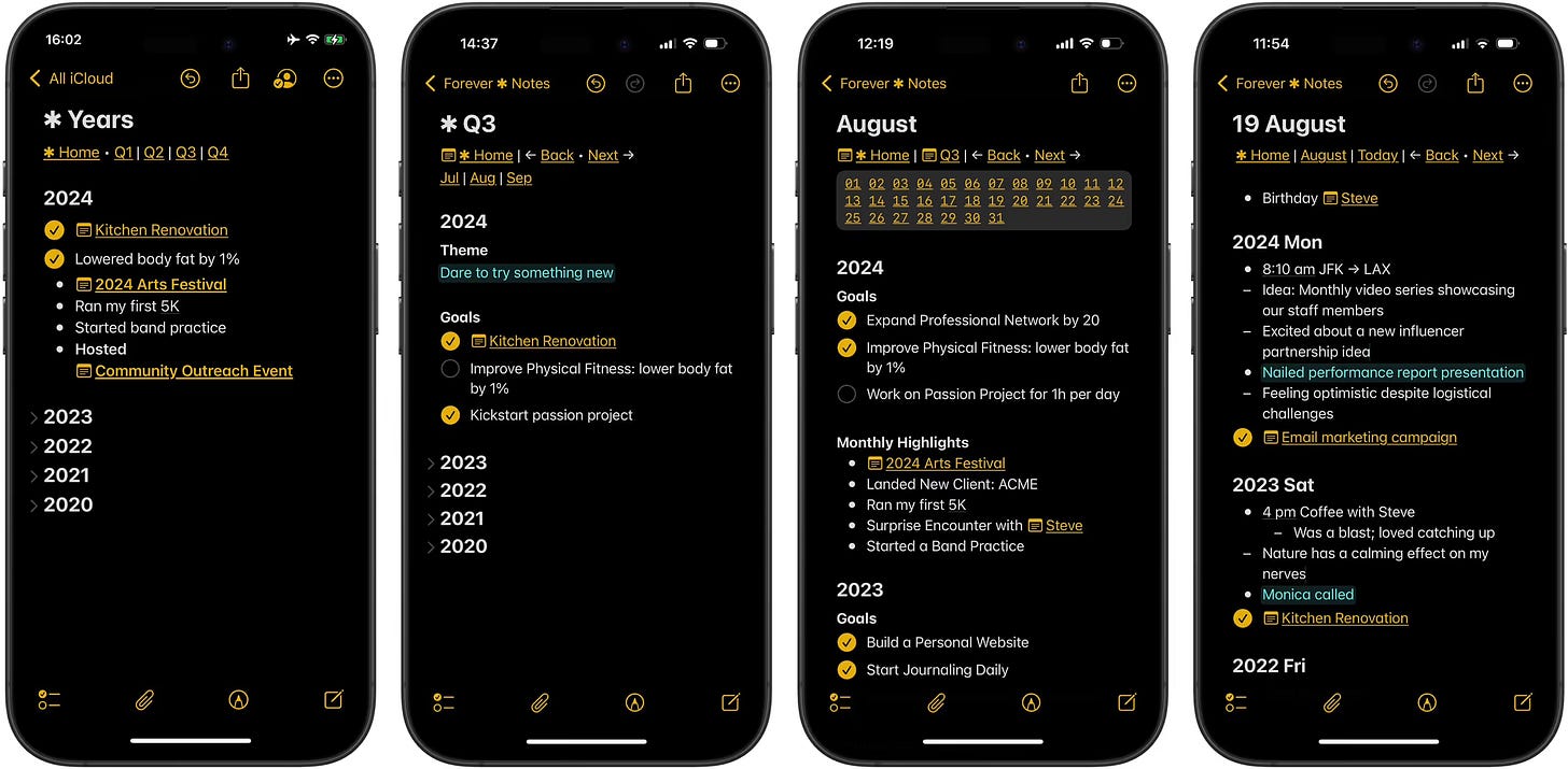
The way navigational linking works in Forever ✱ Notes reminds me of my early HTML development days.
Every new page in the main navigation menu adds the burden of maintaining links to all pages on all other pages in sync. God forbid you decide to swap the positions of links. You must replicate this tiny change across the entire website to maintain coherence. You need an agile system that is forgiving and allows you to tweak it as you change. Like in Kolmogorov Complexity, you shouldn’t write strings like a monkey. Instead, you should write a program that generates those text strings.
A particular pain in the butt is how Apple wants you to change link labels. It requires you to select the link, select “Edit Link”, uncheck the “Use Note Title” checkbox, type an alternative link name, and save. This presents significant friction to your thinking. It’s too expensive to make your notes look half-decent. Moreover, pulling the phone out of your pocket, unlocking it, opening the app, and finding the right note makes you think twice before capturing anything. There are ways to shorten this process, but it’s still too lengthy.
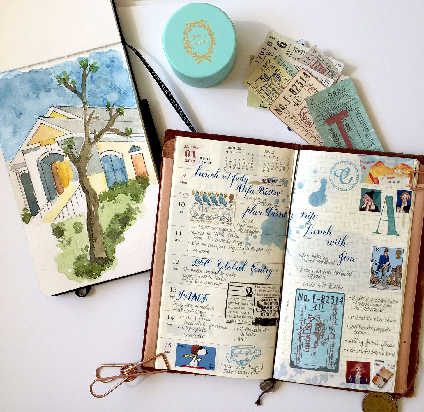
This, however, might not be a show-stopper for you as much as it is for me. Whenever I observe some people investing disproportionate amounts of time crafting splendid analogue notebooks, I realise we’re doing it for radically different purposes. There’s nothing wrong with treating your notebook as an artistic canvas to paint and collage on. But, as far as I can see, the largest crowd of notebook users carries them to jot down ideas and lists. Quick and dirty. I discard my paper notebooks once everything has been migrated to digital form. I retype the texts and take pictures of the most critical sketches. If you’re OK with polishing the layout of your notes at the expense of the speed of thought, the limitations above might not even feel like a burden.
Tags
recommends using two types of links; he also suggests dividing tags into four types.Note Type
Example: #document, #recipe, #resource
If Apple Notes allowed for templating, this tag could be populated automatically. Unfortunately, as mentioned above, this is still not an option unless you create a dedicated Apple Shortcut.
Life Areas
Example: #health, #finance, #work
This one was probably inspired by
’s PARA, which, in turn, was inspired by David Allen’s GTD. Both of them make life areas first-class citizens of their respective productivity frameworks.Details
Example: #cold, #hot, #Italian, #Asian
I’m not entirely on board with this one. Those would be perfect candidates for nested tagging instead. Of course, you could be diligent with your tagging and not mix #Italian with #health or #cold with #finance, but a good TfT (Tool for Thought) should allow for setting up guardrails and automation. In this case, #cold should only be used in the context of #recipe, and #recipe should be populated automatically whenever #cold is used.
Furthermore, the context of the same tag can change its meaning. For example, I have two tags for notes related to Mandarin Chinese: #mandarin-chinese and #language-learning/mandarin-chinese. This is because notes written in Mandarin have nothing to do with learning this language. If I wanted to classify notes by the language in which their parts are written, I’d use #mandarin-chinese and #german. Suppose I wanted to filter only for language-learning-related notes, such as grammar rules or vocabulary. In that case, I’d use #language-learning/mandarin-chinese and #language-learning/german, or even simply #language-learning. In other words, the namespace of your tags can completely change the meaning of the same tag.
This limitation is further exacerbated if you decide to share your notes for collaboration. If nothing is in place programmatically preventing you from going against the framework’s guidelines, you are guaranteed to witness the gradual decay of the quality of your knowledge. The entropy of “broken windows” will undoubtedly set in. This is why typical software development projects have guardrails in the form of source code linting, formatting, and testing. These actions run automatically upon every save and attempt to commit the code to the common source repository. If you do not comply with the guidelines, you cannot participate.
System
Example: #inProgress, #done
I don’t entirely agree with the #done example. If we followed the PARA method, the last A from the acronym, representing Archive, where all of the finished work should go, would translate into a non-smart folder where you could throw your notes so they don’t pop up in your notes reviews. Simply tagging them as being #done doesn’t hide them away, out of sight or out of mind the way, say, Notion would if you were to use their project management database template, which is what you want once you’re #done.
Another concern, once again raised by the lack of tag nesting in Apple Notes, is that I know many people who manage lifecycles much more granularly.
Let’s take the ✱ Projects hub, for example.
Chances are you’ll need a much more specific status, such as #done/completed and #done/cancelled, or #inProgress/working and #inProgress/awaiting. You could adapt your approach to the app’s limitations, but why bother if there are ways to keep your life hassle-free? I knew project managers who’d try to enforce the discipline of maintaining tidy lifecycles by repeatedly asking for specific fields to be filled out. However, no matter how much whipping occurred, meeting after meeting, after a while, everybody, including the instigator of the protocol, would become sloppy and start introducing inconsistencies.
If there are no guardrails, your vault will need serious grooming. Rinse and repeat.
Also, try Apple Reminders with a Kanban view. It might be just what you’re looking for.
#ForeverNotes
In addition to the above tags, all the notes are tagged with the #ForeverNotes tag, which conjures the entire vault.
This is a by-product of Apple Notes, which does not allow you to segregate your notes into fully fenced vaults like other tools. Once again, we must work around the severe limitations of this app’s design.
I wish one could use tags in Apple’s Spotlight. This way, you could also find notes marked with the heavy asterisk and all the notes from the Forever ✱ Notes vault.
An Alternative Tagging Strategy
Generally speaking, the framework suggests that you tag items based on their nature, which is one of the schools of thought that may or may not work for you. Depending on your knowledge manager/note-taker archetype, popularised by
, you might opt for a different strategy: tagging items according to their intended future use.The idea is simple: to read and browse with the end goal in mind.
If you stash something away, chances are you know what it is for and what you intend to do with it later. Therefore, you might want a way to pull together all the hooks you’ve left for your future self when the time is ripe to tackle the earmarked project.
You might prefer the latter if you are a goal-oriented note-taker rather than a curious hoarder, both of which are legitimate note-taking archetypes.
Signifiers
Signifiers are visual cues characteristic of many knowledge management and record-keeping systems. These signs for your future self are supposed to “jump out at you” when you’re flipping through the pages of an annotated book. Therefore, they’re intended to be prominent at higher zoom levels. However, this is not the case in the digital realm, and using a signifier for a quick search may yield potentially irrelevant results. Try searching for a dash; all your notes will “jump out at you”. Here, signifiers only become visible and meaningful once a document has been opened, which occurs at a much lower zoom level.
Interestingly, the asterisk appears in almost all annotation systems and marginalia conventions, although it is generally not given as much attention as in Forever ✱ Notes.
The recommended signifiers to start with are:
✱ A critical note, such as “Home” or a specific hub note, stands out when browsing. Even by skimming the text of this review, I can’t help but notice how my eyes are immediately drawn to the fat black dots peppering it. Since I don’t have the recommended double asterisk shortcut on my computer, I couldn’t add it while writing, thinking I’d add it post-factum. This exercise proved tedious, and I had to use the text-matching function to find all occurrences of “Forever Notes.” However, once the editing was complete, spotting those occurrences was no longer an issue at all. Instead, they dominated my skimming, and that’s precisely the role of the heavy asterisk.
——, a separator line created using six consecutive dashes. Apple Notes merges them into a continuous line that helps your eyes immediately segregate parts of your notes.
(Checkbox) represents a milestone that has been achieved or has not yet been achieved.
•, an event.
-, A note.
1. Priority item (essential)
I’ve seen people introducing emojis as extensions of the system. I’d probably do the same, mainly because the noticeable difference in size between icons, emojis, and standard characters, such as a hyphen, makes those lists look jagged, which can be an OCD showstopper.
That’s it for this week, knowledge engineers.
In the next instalment of this review, we will examine how the framework suggests incorporating your digital journal into your vault. If you are journaling, especially in free form, you might find plenty of inspiration and things to try. If you are not journaling, I hope this will encourage you.
In the meantime, why not take the suggestions above for a spin in your Apple Notes?
Suhrkamp Verlag. (2017, December 1). Die Arbeitsweise von Niklas Luhmann 2/5 [Video]. YouTube. See also Nassehi, A. (2019). Zettels Raum: Ein Gespräch mit dem Soziologen André Kieserling. Kursbuch: Unglaubliche Intelligenzen, 199, (pp. 156–171). Kieserling shares this about Luhmann’s zettelkasten and libraries: “[A] few years ago we had the American sociologist Andrew Abbott as a guest in Bielefeld. In his lecture he showed such a level of expertise for the Zettelkasten that I was surprised and asked him a little later where his information came from. He then said that he had once researched libraries and on this occasion he also got to know the scene of library scientists in America. And Luhmann’s text is apparently very popular among them. They had it translated and value it very much because they believe that they can also learn something about the intelligent structure of a library from it. So they see the Zettelkasten as a solution to their own problems. Books have their fates: While Luhmann is hardly received in American sociology, he achieved classic status among library scientists there through occasional work.”


A fantastic review of the details of Forever * Notes (sorry, couldn't bold this asterisk in the reply :-), the system and its pros and cons, as viewed from a note-takers and note-makers perspective.
I love Apple Notes for its accessibility and ease of use to capture a note on my phone - yet to have Obsidian be as seamless without a mobile app. But its "PKM" usefulness ends there for me.